Showing posts with label architect. Show all posts

Friday, January 13, 2017

New Exterior Paint

One of the most exciting things we have done to the house over the past 2 years is painting the exterior. I didn't mind the original colors of our house but I was anxious to have the trim painted more like the original trim which can be seen in the architect's rendering.

Architect's rendering of our house

I really like the way the architect's rendering has the brown trim around the windows and only the panels above the windows are not brown. If you look at the photos of our house when we bought it the entire area around the windows were colored. The windows looked like one giant color block instead of separate smaller color blocks.

The exterior paint when we bought our house

While trying to pick out colors for our house someone on a mid-century modern message board pointed out that the windows in the artist's rendering are noticeably taller than the windows our house ended up being. I had never noticed this before! It was even suggested to me that after the house was built someone took out the taller windows and put in smaller windows but we can see no evidence that this was actually the case.

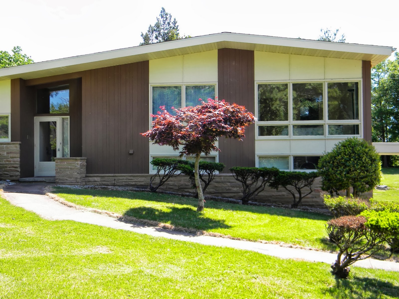
We spent a lot of time trying to pick out colors for the house. Even though I didn't mind the colors we had, I felt the brown was very faded and wanted a more chocolatey brown. And, instead of the cream color I wanted something that was more stylistic of the time period. We talked about turquoise, mustard yellow and olive green. I ended up being scared to try turquoise. I knew it would have to be just the right color to look retro and modern at the same time. I just couldn't decided what that color was and didn't trust myself to pick the right one. I really like mustard yellow but we ultimately decided on olive green.

I liked olive green because it is close to the blue family which I believe was the original color of the colored panels on the house. And, I thought the green also fit in with what I feel is the philosophy of the our house's architecture of blending in with the landscape. I think we are quite happy with how things turned out. Right now, I only have a photo of the paint job from last winter when snow was on the ground and another taken at night. I need to get one on a bright sunny day. You might also notice that we pulled out all of the bushes along the front of the house when we put in the new sidewalk. We have since planted some low, ground hugging juniper bushes that will allow the brick to still be seen.


I will add a photo of the house on a sunny day with no snow just as soon as I can. I'm looking forward to having our leaning light post straightened out! You can also see our new sidewalk in the photo above. We had to get a new sidewalk after our new sewer line was put in which you can read about here. By the way, I have spent tons of time Googling trying to find out the name of the colored panels above our windows. This architectural characteristic must have a name but I can't find one anywhere. I know these colored panels were popular in the mid twentieth century and influenced by the artist Piet Mondrian. If someone can tell me what they are called, I would be so grateful!


Friday, November 8, 2013

Paint Palettes

We are STILL not quite done painting. We have some trim in the hallways and family room to still do. Thankfully we have had some help from my mom because my back is about shot from painting. We are close so I finally decided to take a few photos. I just tried to get photos of paint colors because we still have dressers with no drawers in them and boxes piled up and weird things like that! I took photos this afternoon at 3PM but the sun was already starting to go down I realized.  :(  So, the photos could be better but at least you get a sneak peak for now. All of the colors were picked from California Paints 20th Century Colors Of America which are authentic shades used from 1900-1985. All of the colors we used were from the year our house was built.

Our bedroom is my favorite color! In our old house our bedroom was a very deep burgundy color. Everyone hated it but me. I was finally convinced to ditch the burgundy because it was not appropriate for our house. But, I wanted something that still would compliment the bedspread, wall hangings etc. from the burgundy room. I decided I wanted a pinkish brown color but I DID NOT want pink. I was scared to death I would think I found something then get it on the wall and it would be pink. It is a miracle that I somehow found exactly what I had hoped for!! It has just a touch of pinkish and I think it also transitions nicely into the pink and blue bathroom. (I keep saying "I" because I tried to include my husband in picking colors but he didn't seem to have a lot of interest. He did give some input but he mostly let me choose.)

 I settled on University Square by California Paints. Unfortunately, the photos of our bedroom are the worst. I don't think they nearly show off how great this color is. I will have to get better ones later. You really should click the University Square link above to get a better look. I really like the way all of the colors we picked bring the outside colors inside. I believe this was one of the architectural goals of the style of our house which is one of the reasons for the large windows. Outside our bedroom window is a Japanese Maple Tree. The pinkish brown paint really brings out the pinkish purple colors in the tree. Unfortunately I didn't realize when I took the photos that the tree is quickly turning brown and shedding for the winter.

Japanese Maple tree outside bedroom window before it turned cold.
The view from our bedroom. The Japanese Maple is looking a bit sorry now. Just the other day it was still beautiful.
I wish this picture showed the paint color off better. I LOVE it! Ignore our horribly wrinkled bedspread.
For the second bedroom (originally the girl's room) that we are using as a dressing room, the family room and the upstairs and downstairs hallway I chose Gobi Desert by Behr. This was a neutral color that was much easier to get from Behr than trying to get a copy from California Paints but there are several similar historical California Paint Colors. It is kind of a khaki color. I love that it is very neutral but just dark enough to have a punch of color. It also goes with the burgundy items from the old bedroom and compliments the colors in the beautiful trees you can see outside from the large window in the bedroom.

The dressing room, family room and hallway colors. I'm not sure if the white trim was the right choice.
The downstairs of the house is a bit more modern than the upstairs since the family room was done almost 20 years after the house was built. I wanted blues in there and thought since it was more modern I might paint it a deep blue color. But, we have lots of blue pillows, wall hangings etc. so I came to my senses and decided to do the Gobi desert down there also. I decided it would compliment the blues nicely. And, my husband was more anti-blue basement than anything else having to do with paint.

The family room is not finished but here is a glimpse of the color inside a white trimmed shelf.
Our "hobby room" (originally the boy's room) is a steel blueish grey color form California Paints called Industrial Steel. I thought this color might go well with some black and white photos I would like to hang in this room. I can see some of the original blue paint color that was in this room peeking out in places. It looks like it might have possibly been a very similar color at one time. There is a beautiful deep, deep green magnolia tree outside the big window in this room. It is so green some of the leaves almost look blue which again makes the blue paint a nice frame for this window.

The kitty looking outside at the Magnolia tree.
The "hobby room"
We have our new dining room set home and we really like the way it looks in the family room. Even the orange seats which I immediately wanted to change look so nice with all of the wood and the style of the house. I would almost be tempted to keep the orange but it just isn't me. It is too vibrant and not peaceful enough. And, we already have olive green living room furniture in the same room so the orange and green would really be over the top! I already have fabric to cover the dining room chairs. Maybe this weekend I can do that. I need to do a little bit of research on upholstering tonight.
New dining room set. Can you spot the sleeping kitty?
New fabric for dining room chairs.
New fabric
Now that all of the colors are starting to come together I am getting really anxious to paint the kitchen. We saved it for last since it has no furniture in it that we will have to work around. Also, we were trying to decide what we were going to do with the cabinets before we painted. I think this winter we are going to have the cabinets stripped back down to their natural wood instead of white. So, I think it would be best if we paint before instead of after they are stripped. Then we don't have to worry about getting paint on the cabinets as much.

The kitchen will be an olive green color from Behr called Spartan Stone. It is another match to a historical California Paint color. I love the olive green and it will go with the olive green furniture in the dining room and living room since the rooms are all open to each other. My husband might kill me if I ask him to paint that room before Thanksgiving. We have done so much painting!! There are some really high walls in there and he has to do all of the high parts since he is 6ft 5in. But, hopefully someday soon I will have kitchen photos for you! And, some full house photos!! Hopefully you caught a few glimpses of the floors in these photos. Taking photos of the floors requires them to not be covered with boxes!!! Still coming!

Saturday, June 15, 2013

No More Imagining

I no longer have to try imagining what a redwood stained house with aqua/ blueish trim would look like. The woman who grew up in the house sent me a photo of the framed architect's rendering of the house.


Hmm, it's not quite as crazy looking as I was imagining. I wonder if there is any way this could work in 2013. I actually found this webpage where someone is trying to figure out how to keep the turquoise doors on their house and make them work.

Friday, June 14, 2013

Acceptance

On Sunday we got a call from the realtor that our offer had been accepted. She said the owners were moving to Hawaii and wanted to take as little with them as possible. They were willing to include any of their furniture in the deal with the sale. She also said they were very sad about moving due to their retirement. They were very happy we made an offer the day the house went up for sale because that must have meant that we really loved it. We had to go back to the house before Mother's Day dinner to look at the furniture and decide if there was anything we were interested in. We also had some questions about the property lines and were told the original plans to the house were available in the cupboard and could most likely answer any questions. Jackpot!!!


Our house was custom built in 1960. The plans indicated what the original flooring was for the entire house. The main floor was TERRAZZO!!!!!! We were so excited. Terrazzo is beautiful and virtually indestructible. The upstairs was cork and the basement was cement with cork in the den. All so much better than gross, dirty carpet. The big question was if it was all still there. We were able to peel back some of the carpet and it appeared to all be there in decent condition from what we could tell.

Original Terrazo floor under the carpet. At the bottom of the photo is the tiled entry way.
 
Original cork floor under the carpet in one of the bedrooms.
Now we can plan to have the all of the carpet pulled up and refinish the terrazzo and cork. We will have the cement in the basement polished. The Laundry room and kitchen have laminate flooring and the entryway has tile. We didn't have any particular problem with them but they are supposed to have terrazzo underneath so we decided while we are going for it to have the whole thing redone. The last bit of exciting news was that the original owners name is scrawled across the plans in huge letters!! Now I could do more research on the history of the house.